City launches new COVID-19 data maps including neighbourhood positivity rates
Posted October 19, 2020 3:00 pm.
Last Updated October 19, 2020 4:29 pm.
Led by the City’s top doctor, Eileen de Villa, Toronto Public Health has released additional, more comprehensive and detailed data on the COVID-19 positivity rates of different neighbourhoods.
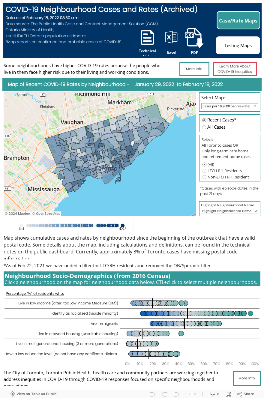
As of Monday, de Villa says the most recent data maps, of which both include neighbourhood percent positivity and testing rates, can be accessed on the Toronto Public Health dashboard.
For the most recent week, the hardest-hit areas are found in the northwest corner of the City.
The data revealed that Brookhaven-Amesbury has a 12 per cent positivity rate, and Black Creek is at 10.8 per cent.
According to the map, Mount Olive/Silverstone-Jamestown, Jane Heights and West Humber-Clairville are the areas reporting the most cumulative cases to date with 708, 705, and 700.
“The inclusion of neighbourhood data comes with the important qualifier that the per cent positivity should not be used in isolation,” de Villa said.
“It is more meaningful when considered in combination with other indicators of pandemic activity, including number of cases, case rates, and testing rates. We also know that the virus is spreading to different extents in different parts of the City,” she added.
De Villa says the board of health also supported her recommendation to increase access to testing in high transmission neighbourhoods and to make public health information more accessible in other languages.
“These are things that matter in so many respects. I think we can all agree that a City fuller with health people is better for us than a City dragged down by the costs of preventable illness,” de Villa said.
Public health officials consider 3 per cent a critical threshold for test positivity.
Case information is updated three times each week on Monday, Wednesday and Friday.
Testing information is updated once a week, coming in on Thursday.